
My Approach: Crafting Digital Excellence
Kita is a multi-talented professional with over 4 years of experience in web design, writing, brand strategy, video editing, content creation, and brand influencing. She has a keen eye for design and a deep understanding of user experience and has created stunning, responsive websites optimized for SEO and user engagement.
She is also an accomplished writer with a talent for crafting compelling stories and informative content and has developed comprehensive brand strategies for various clients. Kita is also skilled in video editing and content creation and has a strong social media presence as a brand influencer.
Vision
To create a thriving community of financially savvy and independent young entrepreneurs who are not only achieving their financial goals but also contributing to the economic growth and prosperity of Nigeria.
Mission
To empower young Nigerians with the knowledge and tools they need to unlock their full financial potential, fostering a generation of self-made entrepreneurs and change-makers
Resolving Complex Problems
The preceding brand identity conveyed a degree of seriousness and the client's preference was for a new brand identity that strikes a balance between seriousness, approachability, and vibrancy. The objective was to create a versatile identity that can seamlessly adapt to various use cases.
Logo Design
The Kitavibez logo embodies the brand's mission to empower youths financially and personally while exuding energy and a sense of community. The icon features a custom K ending in a z shaped like a lightning bolt, symbolizing the brand's striking impact on development, empowerment, and financial prowess. This dynamic icon radiates energy and vibrancy.
The logo also employs a sleek sans-serif font, conveying a sense of cleanliness and trustworthiness. Paired with the impactful lightning bolt, it communicates Kitavibez's dedication to empowering and energizing the youth, inspiring them to seize control of their lives.
Colours
The brand's color palette is characterized by lively and vibrant hues. The primary colors, purple and orange, imbue the brand with a sense of sophistication and energy. Complemented by carefully selected secondary colors, the palette not only enhances the primary hues but also ensures versatility across various applications.
Iconography
The iconography comprises symbols that embody the fundamental values of the Kitavibez brand. Furthermore, these icons contribute an additional layer of personality to the brand, enhancing its presence across various touchpoints.
Brand in Action


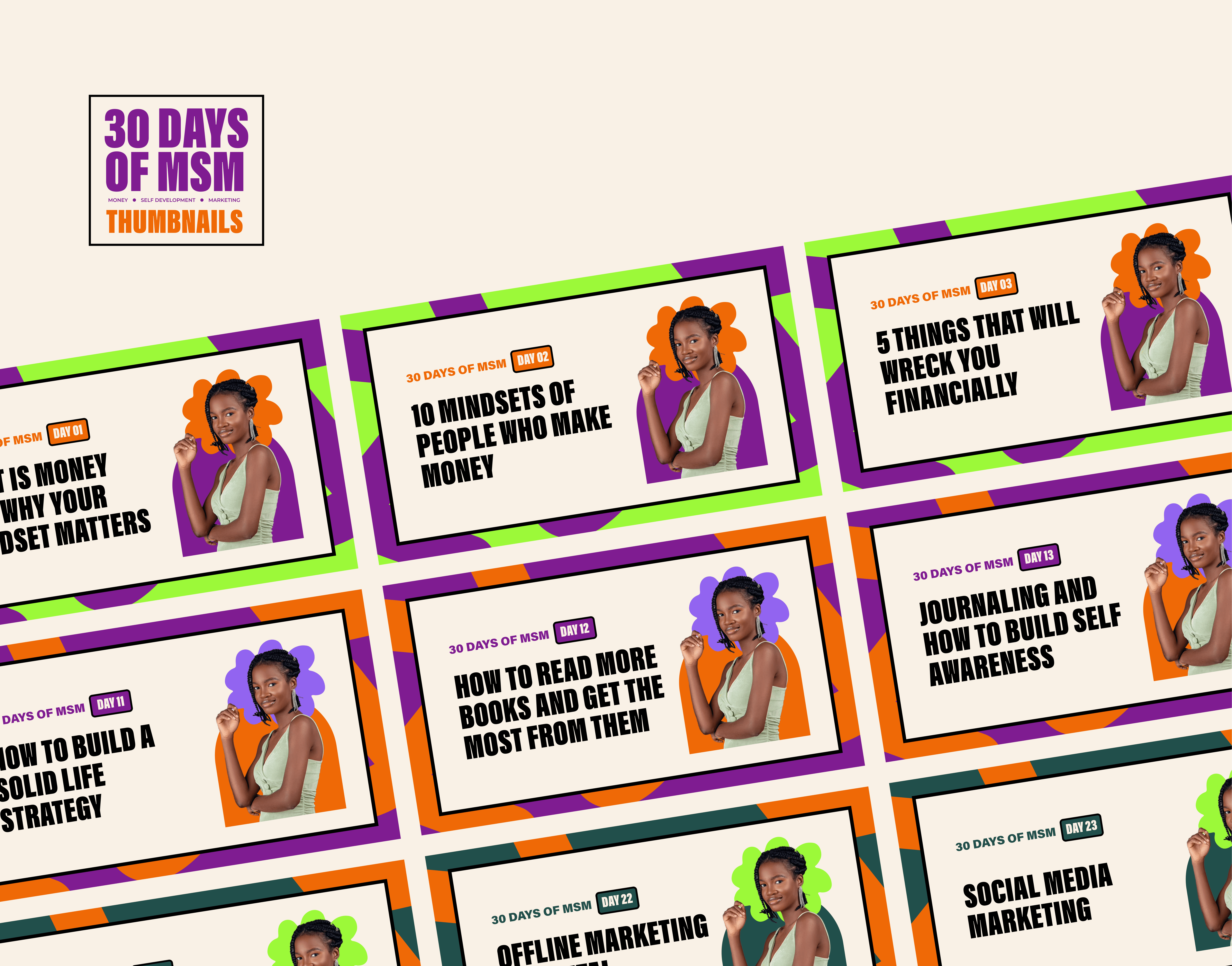
Other sub-brands were developed for distinct use cases, showcasing the versatility of the identity. The flyers below adopt a neubrutalist style, imparting a bold and edgy aesthetic..


Meeting User Needs
The evolution of a brand is an ongoing process, and as the Kitavibez brand advances, its identity will continue to adapt and align with its trajectory.
Thank you.

